
COLUMBUS COTTONMOUTHS
It’s no secret that we love hockey here, so when we were commissioned to rebrand the Columbus Cottonmouths of the SPHL we were ecstatic. Head to toe, full rebrand – a sports design firms dream
LOGO DESIGN
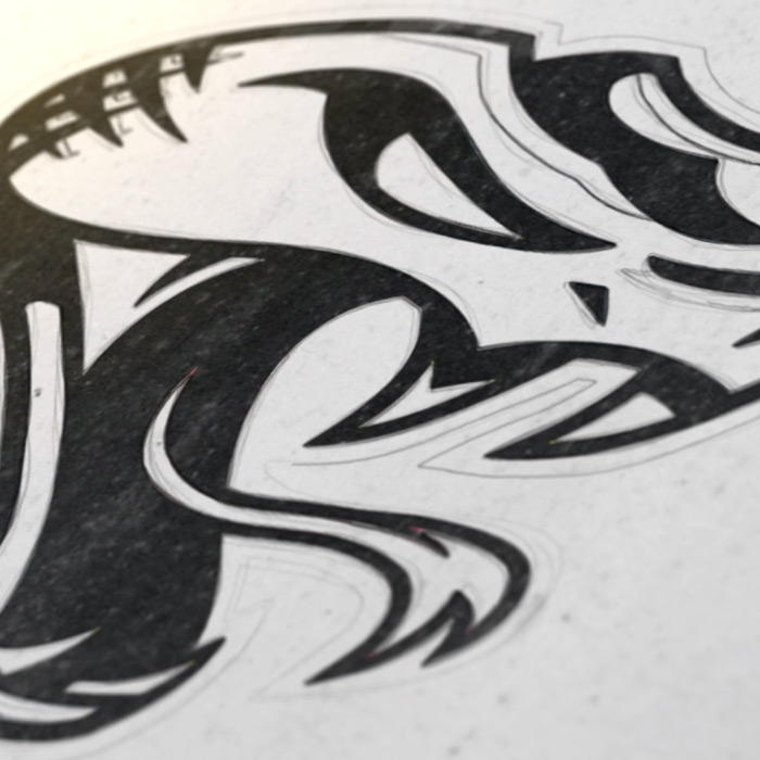
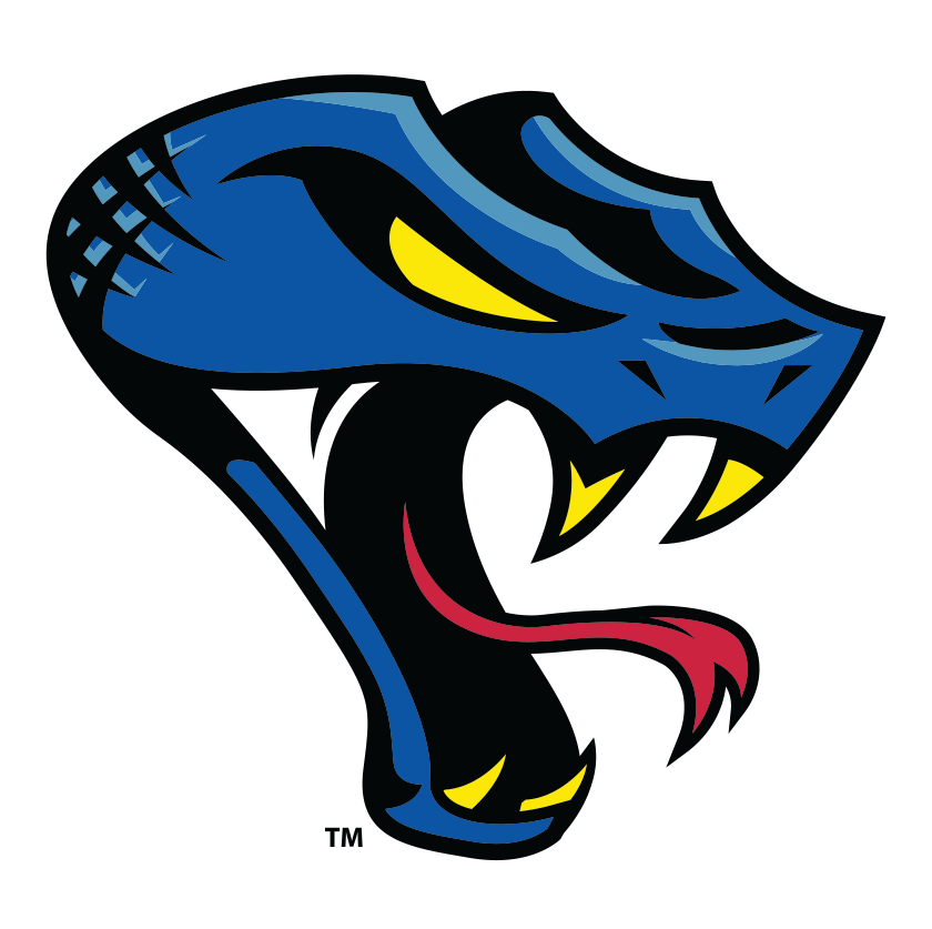
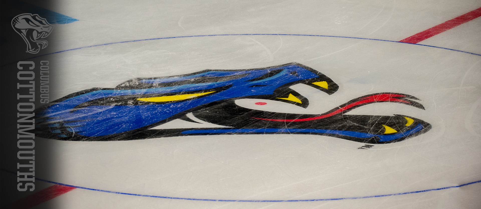
Through research, testing, and a whole lot of sketches we realized that the snake head definitely needed to stay (over a full body snake), but the previous rebrand just wasn’t grabbing the fans. We were tasked with not only making a great logo, but creating brand consistency across the organization. Our solution was to angle the cottonmouths head and give it more “snarl”. We also love how the head flows like water, representing the Chattahoochee, where the team is based
UNIFORMS
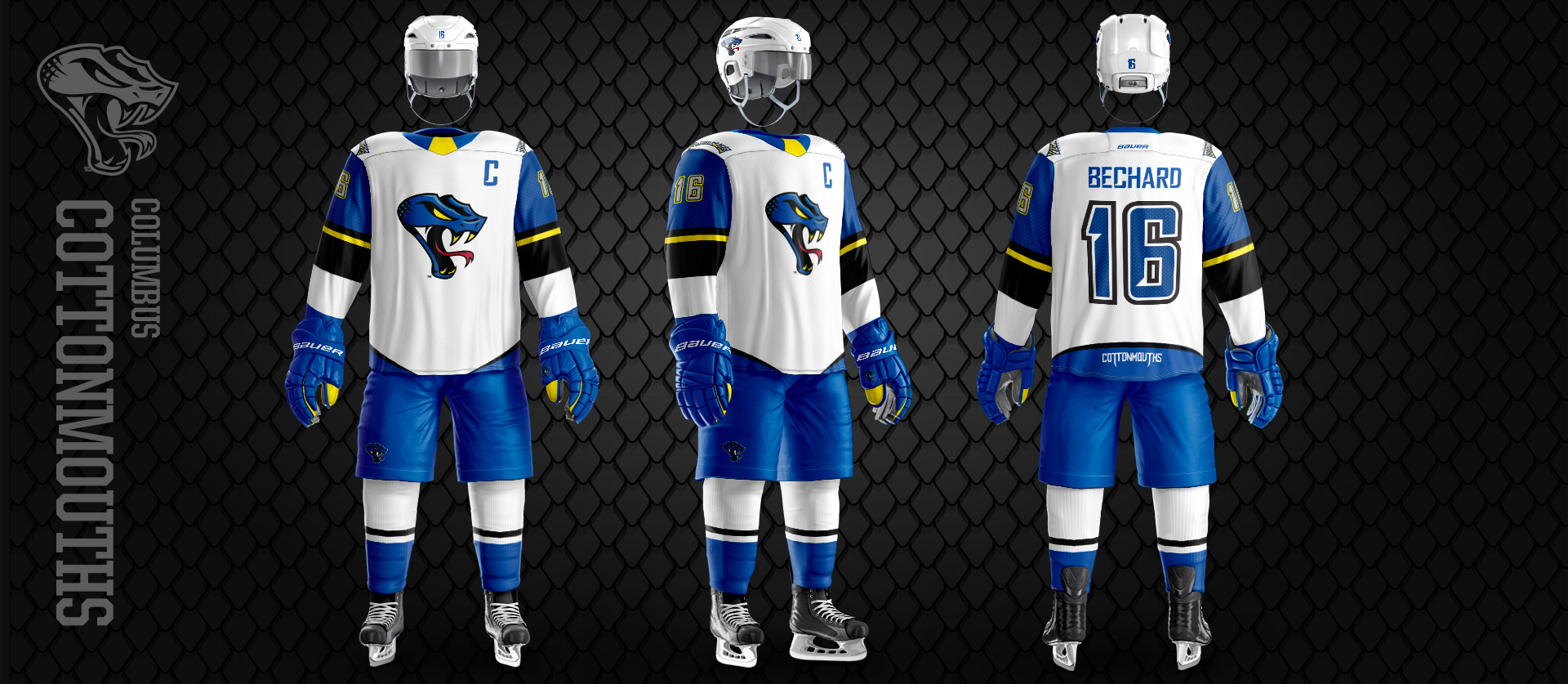
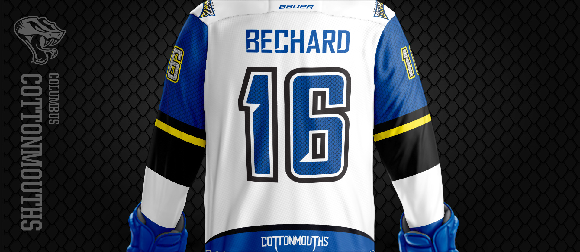
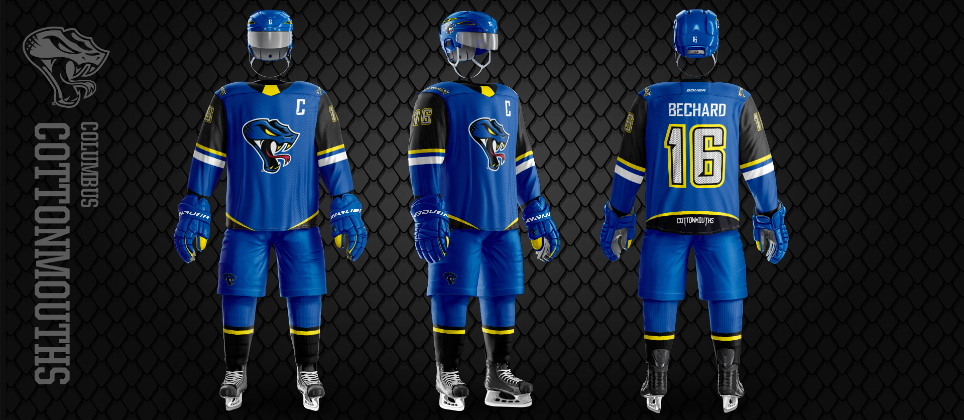
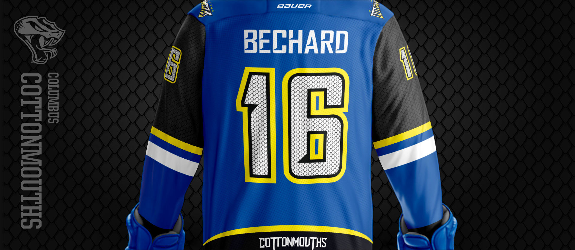
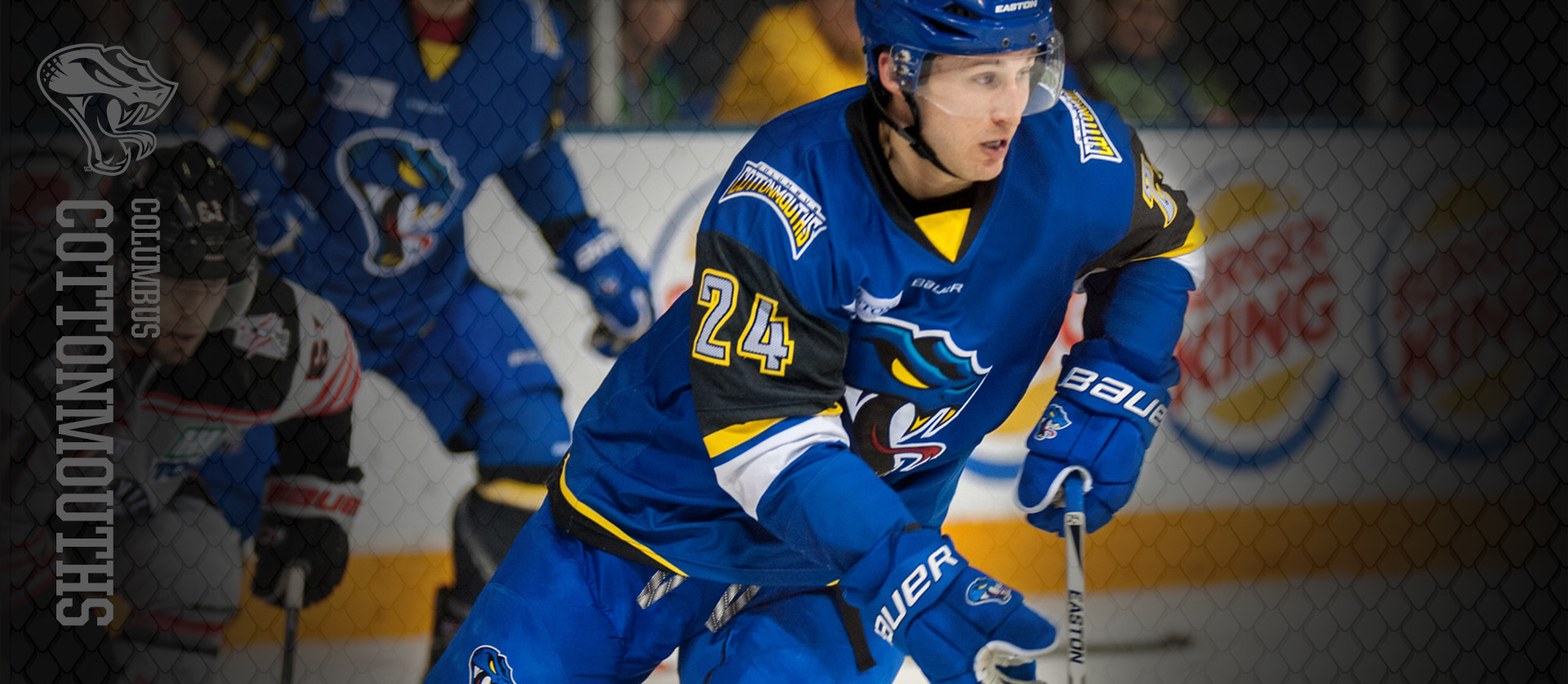
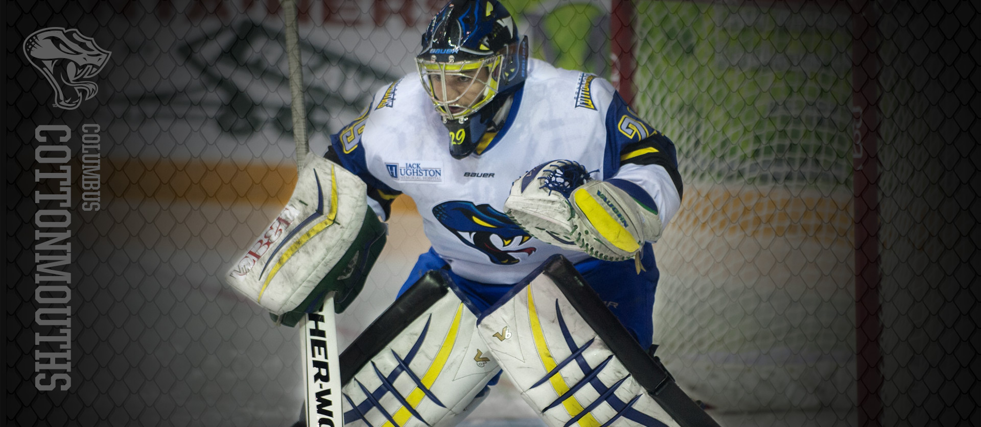
The uniforms is where the diverse nature of Columbus fans came into play. While a minor league team across all sports leans towards a younger crowd, the Cottonmouths also have a denser fans base of adults. We merged these with a clean & crisp jersey design, but with details for a younger fan base. That detail is a subtle custom snake skin pattern that lays inside the arms along with a hanger effect of the teams chant. That detail of the snake skin pattern made their way into the numbers as well. We customized the typeface used across all media for the numbering system and inlayed the snakeskin pattern. The devil is in the details.
MERCHANDISE
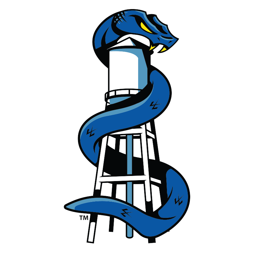
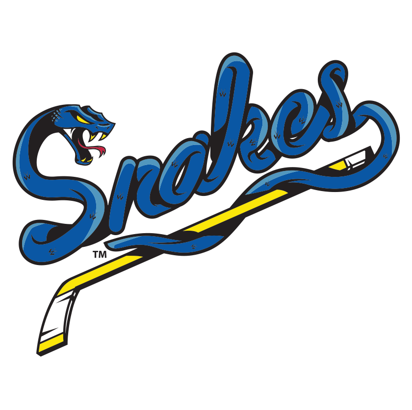
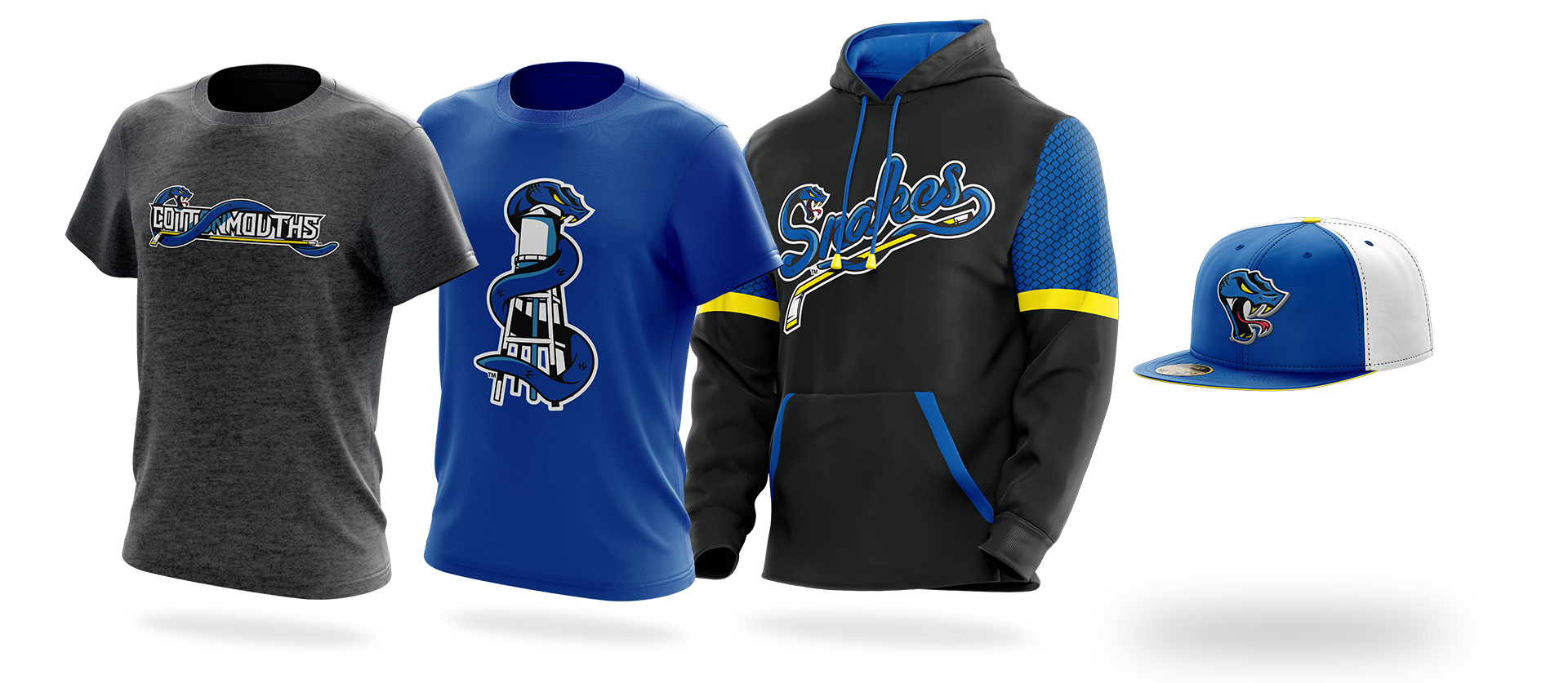
But like most of our projects, we went above and beyond. Along with primary logos and jerseys, we also made a whole slew of tertiary logos and designs that bolster the primary branding. And mostly hyper localized. From the Snakes word mark (fan nickname) to the Cottonmouth wrapping around the Columbus water tower we wanted to make a brand that local fans felt like was made specifically for them, because it was.
BRANDING
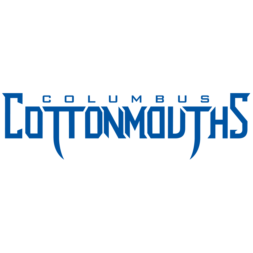
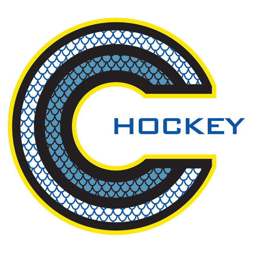
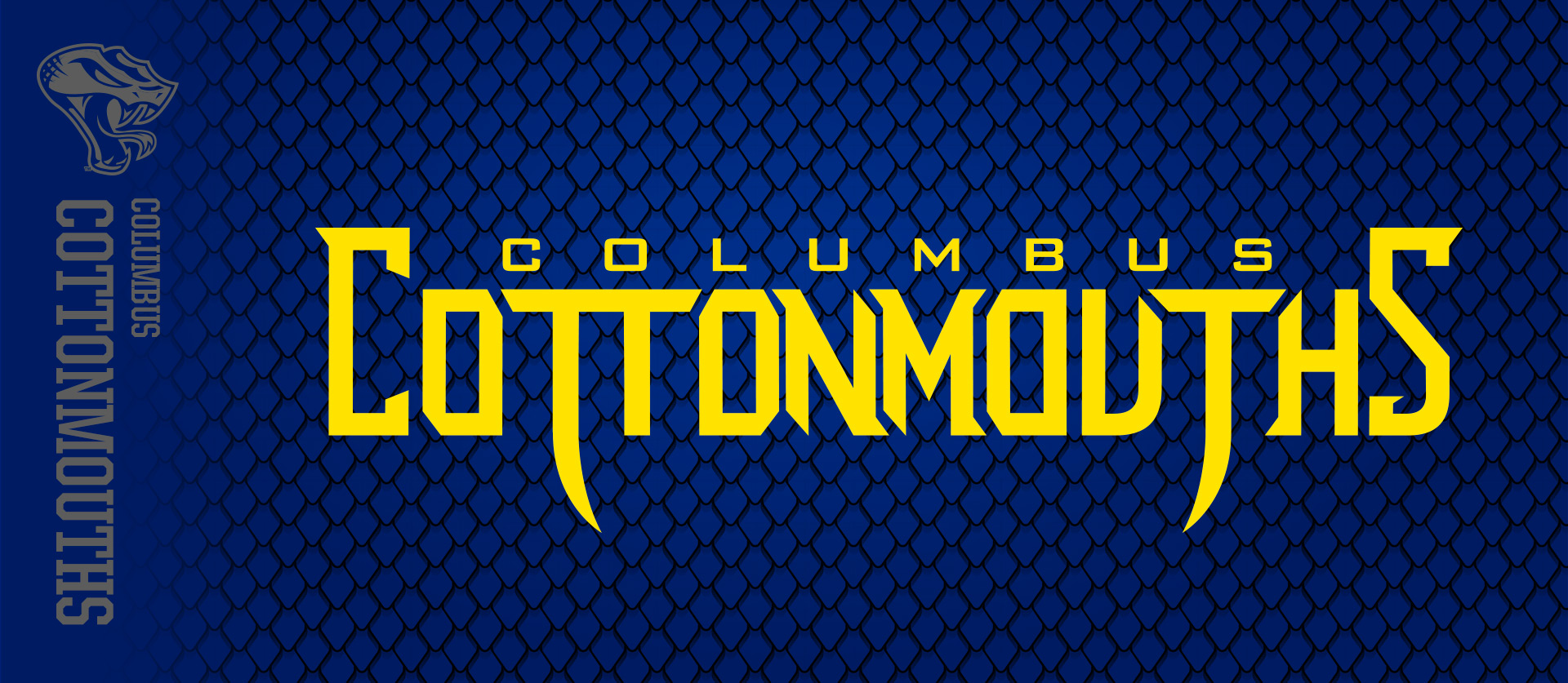
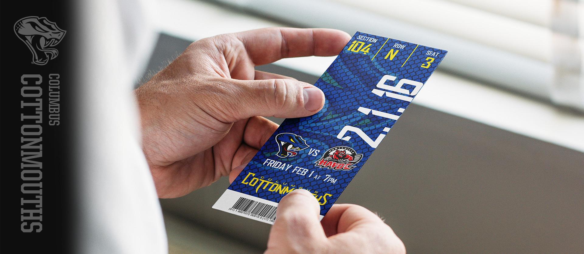
We extended the brand in all aspects. We wanted to make a type lockup that spoke to the team, but Columbus as well. So as well as creating something with sharp lines, we were inspired by the industrial history of the city. It is designed to both give emotions of snakes, while also a masculine, industrial feel resembling the Columbus Iron Works. The snake skin pattern found it’s way onto tickets and season ticket holder boxes. and the logo looked even better at center ice. Not many minor league hockey teams have a 80 page brand guideline, but the Cottonmouths do!
The Barn helped us take on the exciting task of revamping not only our logo, but our entire brand. We couldn’t have been more pleased with the attention to detail and assistance with project management from Nick and his team. <It> was terrifying, but The Barn made the process feel almost effortless and brought our vision to life in the most vivid way.
Abbie Meadows
Marketing Manager, Columbus Cottonmouths
Results
Our biggest professional re-design to date has also been our largest award winning. The Barn was awarded with a Top 50 New Logos of the Year in 2016. With the Creamer Awards being the top of the top in sports design, them putting us in the same group as teams like the Toronto Maple Leafs is a pretty high honor.
Beyond awards for our agency it was wildly successful for the team as well. We all know that sports design is closely related to merchandise sales, and it is even more important in the minors where every dollar counts. We are proud to say that the Cottonmouths merchandise sales were more than double the year they launched the new branding!
PREV
THE ARCHIVES
