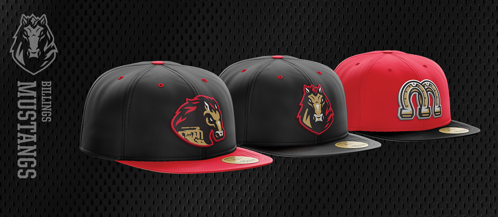
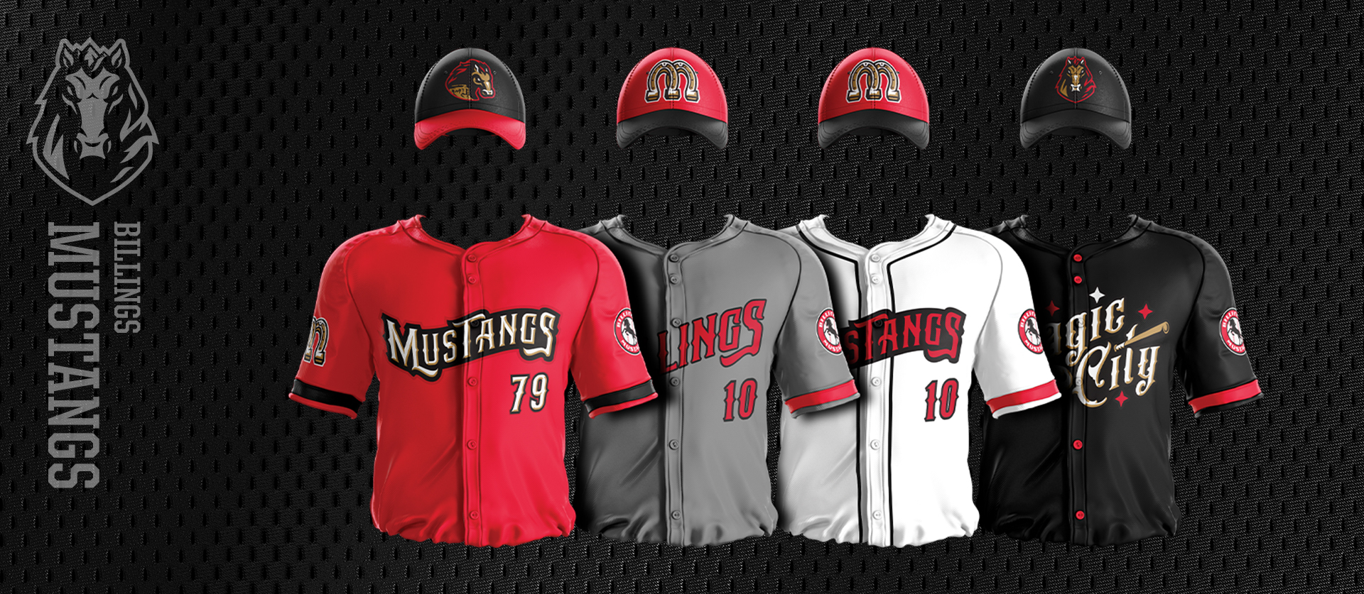
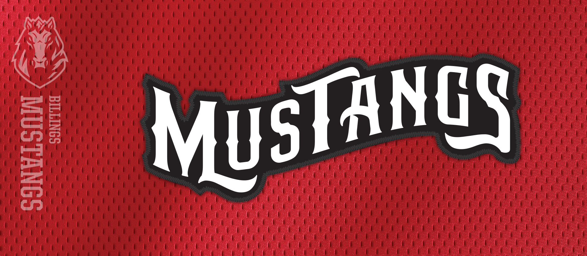
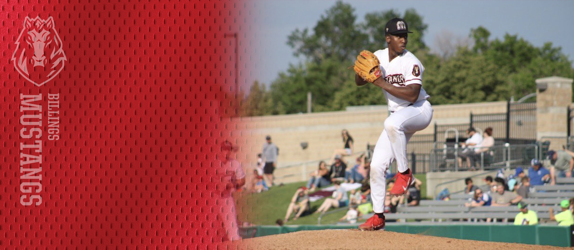
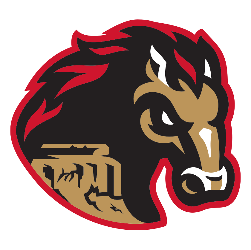
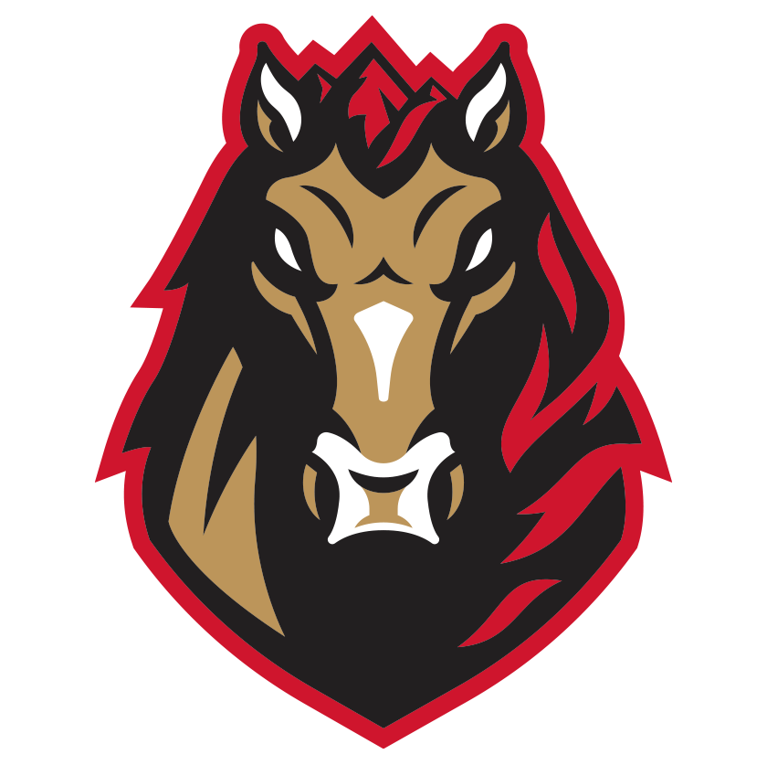
Right out of the gate we stated that “on paper” they had a lot going right in their visual branding. The previous marks were well done, but the tone of voice wanted and needed to be updated for ownerships new vision of the organization. We wanted to bring some history back to the logos in simple ways, and push the look where we could. This was going to be more of a revamp than a total redo.
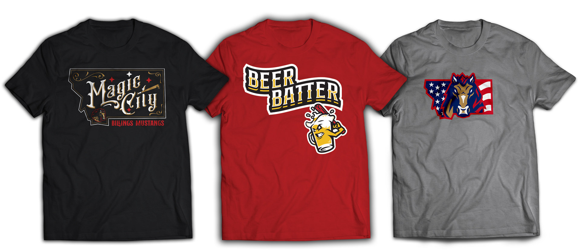
This updated and more western look for the Mustangs drove us into a “Friday Night Lights” brand we fell in love with during our research and development phase. Billings has a great nickname of “Magic City” that came about from the rapid growth in the 1880’s and we just had to make a “City Jersey” for this. Keeping this overall western theme, it just brings some fun and local flair to the brand overall. Much like the “Rimrocks Mustang” this mark is 100% about making it specific to Billings and not just an updated logo.

