OC Squeeze Logo
OC Squeeze

OC SQUEEZE

Having fun with color is a great way to get your team brand to stand out of the crowd. But how can you embrace fun, while also trying to become a merchandise seller to the greater area?
LOGO DESIGN

Our first crack at this branding was over the top fun. An actual orange with a mean face bunting on a “squeeze” play. It was fun. It was youthful… and completely what everyone else is doing in minor league baseball. Our secondary logo came out so classy that we realized that it wouldn’t just sell merchandise for a baseball team, but for an entire county!

UNIFORMS

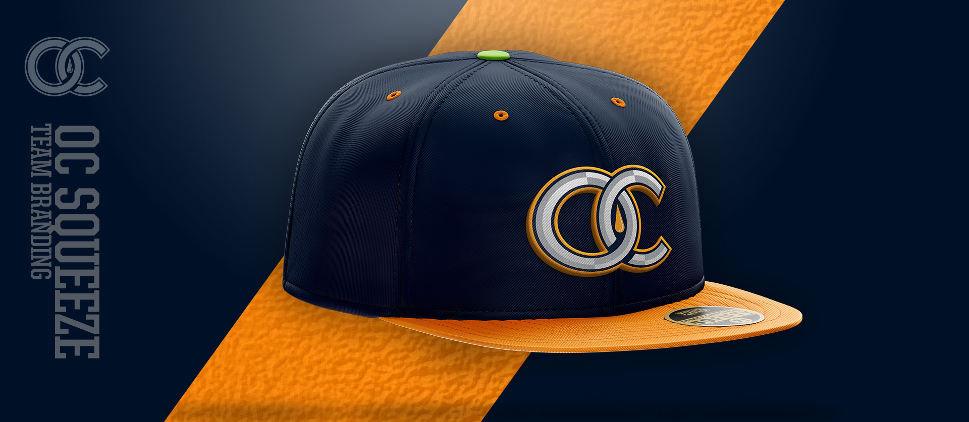
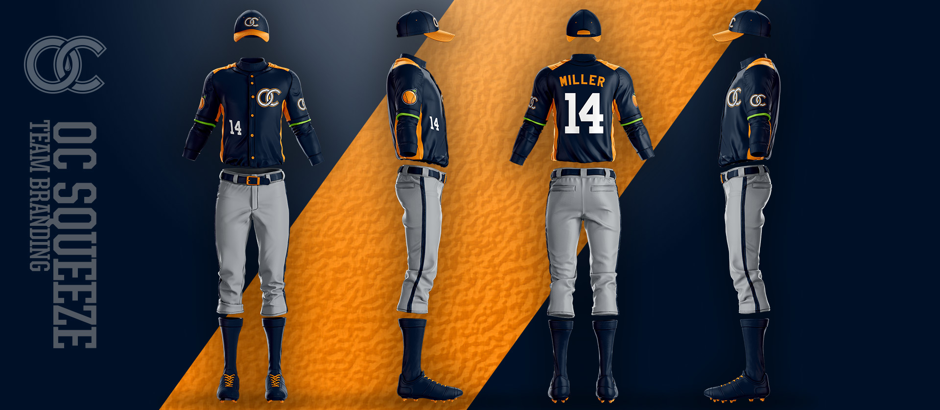
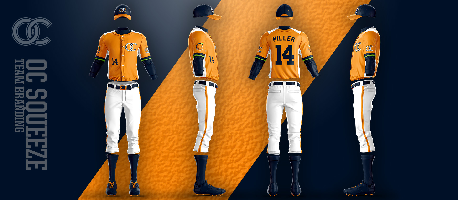
Where we pulled back on the logos we ramped up in the uniforms. Orange uniforms with citrus green accents paired with a nice navy blue for contrast. We tried to make a hat that would appeal to everyone in Orange County, not just baseball fans. We love that little pop of “Citrus Lime” on the top button as well.

Trying to make a classy design to sell, but still have fun. We love that little pop of “Citrus Lime” on the top button of the hat”

Nick Matarese

Founder, The Barn

Results

This league folded just weeks before these ever hit the field, making it an almost depressing piece of work for The Barn. It is the nature of the beast in minor league baseball and we hope that maybe someday these designs can be revived!

We aren’t the only ones who agree with that statement as this team identity design won us an America Graphic Design Award in 2015.

Delaware Met Griffins PREV DELAWARE MET Long Beach Cudas NEXT LONG BEACH CUDAS