The Mill
The Mill

THE MILL

We were commissioned to create the brand identity for the newest coworking space in Delaware. A really dense branding, we not only made logo marks, but an overall tone of the space. Pushing a very masculine feel as the space has a connection to the Hagley Museum and the DuPont gun powder mills…. hence the name.
BRANDING

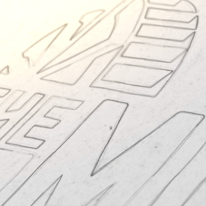
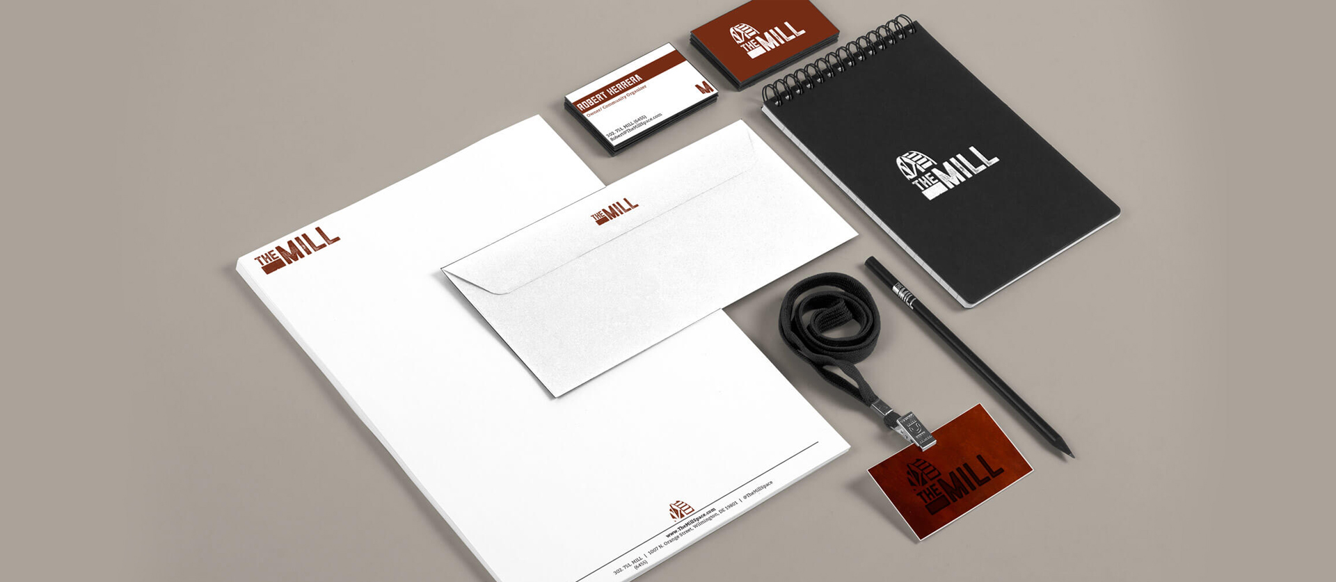
We wanted a very rustic and gritty feel to the brand while connecting to the DuPont Eleutherian mills into the mark.. A full logo package and design pushed that rustic, gritty feel all the way down into the color scheme. A color we call Corten Steel makes the primary look give an emotional connection to rust, a separation from most coworking spaces in the area that lean towards a feminine design.

COLLATERAL & INTERIOR DESIGN

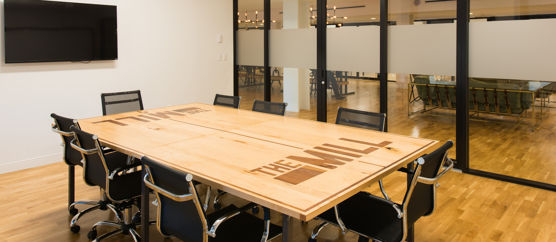
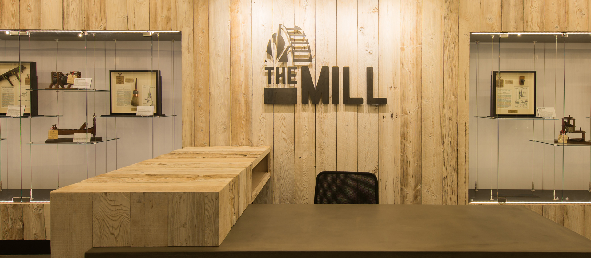
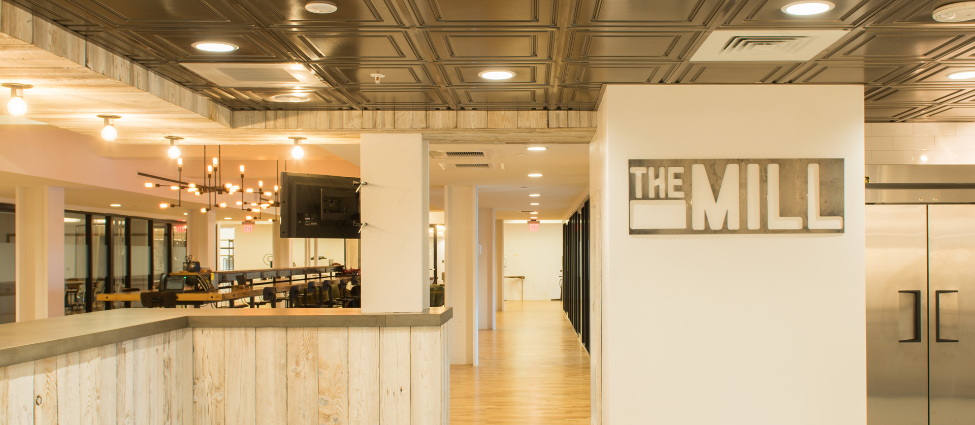
An extremely dense branding package which rolled into way past business cards and letterhead. It is stamped into concrete countertops and inlayed in conference room tables. The Mill has taken our branding and really shown off its full potential.

Branding is so important for start-ups wanting to make an impact in the community. The Barn helped our team immensely while establishing our visuals. We are so grateful for that and will always recommend Nick and his team!”

Rebecca Ashton Parsons

Director Of Operations, The Mill

Results

This work was awarded with an American Graphic Design Award in 2016, but beyond that has shown off the depth we give to each and every one of our brands.

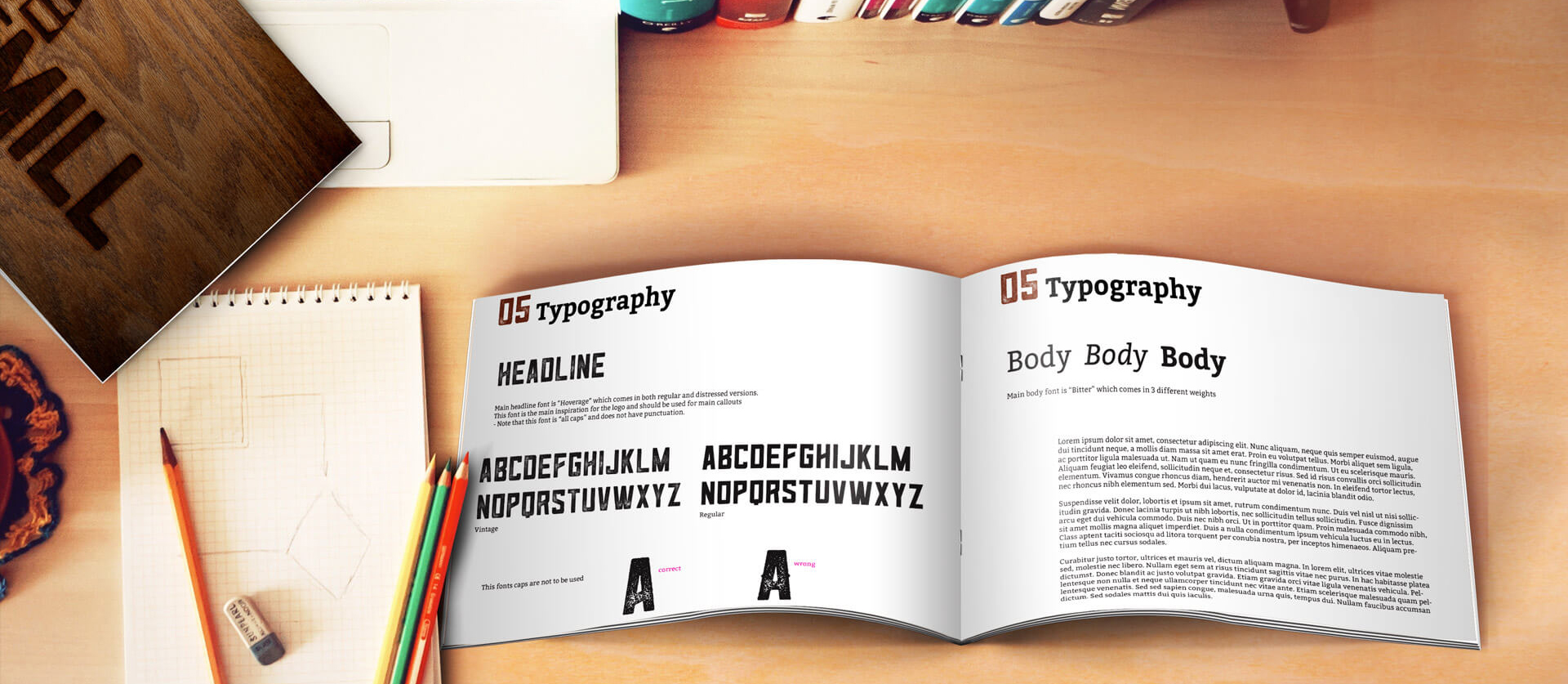
Our most proud piece of the branding might be the guidelines themselves.

VIEW BRAND GUIDELINES

Delaware Blue Coats PREV DELAWARE BLUE COATS Delaware MET Griffins NEXT DELAWARE MET